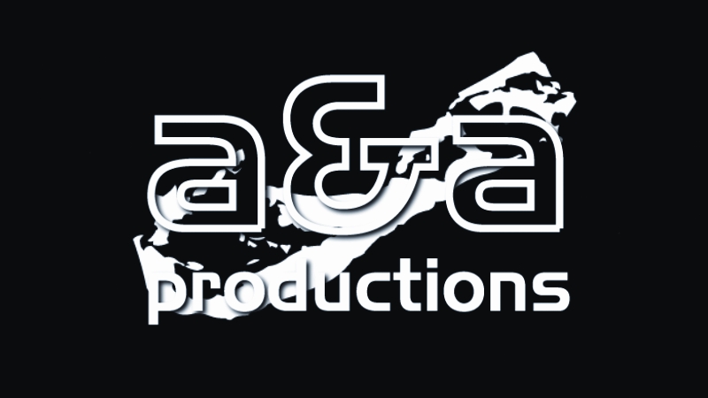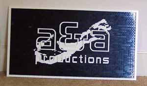

I was contacted by someone at 'a & a productions' and sent a few renditions of their logo and asked if any could be translated into a mosaic made of LEGO bricks.
The images were pretty straightforward (though I never did ask exactly what that shape is in the background, behind the letters -- an island? a bone? what?).
The best image was just black and white (see below).
Of course, with white letters on a partially white background, some style of 'relief' was needed so that shadows would be cast by the letters.
And, of course, there were the letters to deal with. The letters of the logo are very much curvilinear. Normally very unfriendly as far as LEGO bricks are concerned.
A little creativity with LEGO arches, however, managed to do the trick. The variety of curved arch pieces is rather limited, but fortunately I was able to get by turning some upside-down and such. One will notice that the ampersand is of a slightly different style, but I think it works well.
With the whole piece so dependent on the arches, the overall sive was dictated by the size of those curved elements. Luckily the scale worked out so that the final mosaic was about 3 feet wide and 20 inches tall. A size with which the client was quite pleased.
I built the initial prototype without glue to make sure the arches would in fact do their job.
I designed the curved letters first and then ran the background image through my mosaic program (on Studs-Up orientation). This gave me printed instructions for the background shape. I then penciled in the curved pieces on top of those instructions and figured out where I needed to use tiled pieces and back-protruding pieces that would slide into holes in order for the upside-down elements to be held in place. Here's a close up of some of the letters in place -- excuse the 'C' which was bumped out of position a bit.
Once approved by the client the model was then taken apart and reassembled using glue.
A couple more pictures of the center: 1, 2.
P.S.: A certain Christopher Palamara has been kind enough to inform me that the 'thing' in the background is, in fact, the island of Bermuda. That answers that, I guess.
